Rick Gore
Rick Gore / Work / Icertis
Icertis

In a sea of cold colors,
warmth is a differentiator.

How a competitive audit of the AI industry became the strategic argument for a brand that looks nothing like its category.

Company
Icertis, Bellevue WA
My role
Senior Director, Brand and Marketing — strategy, identity, stakeholder alignment
Year
2025
Disciplines
Brand Strategy · Visual Identity · Competitive Research · Organizational Influence
Icertis Brand Guidelines 2026 — cover and interior color spreads
The new Icertis Brand Guidelines. Vera Rose, warm neutrals, and a palette system built to stand apart from every other company in the category.
8%
Banner ad CTR in the new identity. Industry benchmark is 0.5%. The system is performing.
87%
Of CLM category competitors using oversaturated blue. The brief for differentiation wrote itself.
0
Competitors using a warm, human-centered palette in the CLM category. The gap was that wide.

Icertis is a global AI-powered contract intelligence platform. One of the most sophisticated products in its category, trusted by some of the largest companies in the world. The brand did not reflect that.

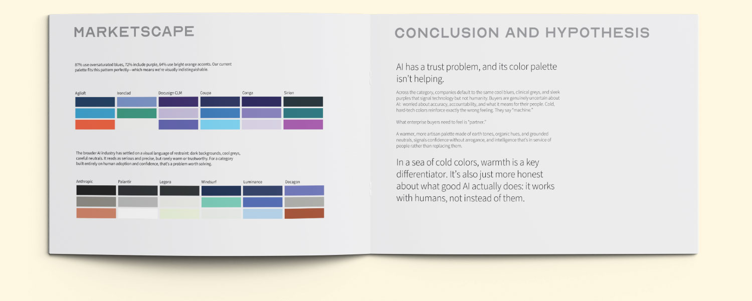
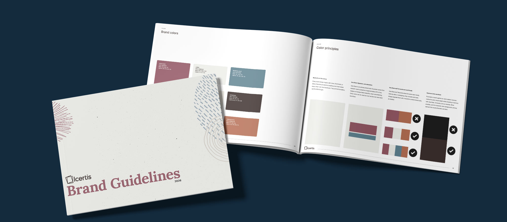
When I joined as Senior Director of Brand and Marketing in 2025, the visual identity was anchored in a mid-2010s enterprise SaaS aesthetic: oversaturated teal and navy, a blue gradient signaling "glowing tech energy," a 12-degree trapezoid motif used as a layout device, thin connector lines that looked like legacy PowerPoint tools, and double-exposure photography that had become a visual cliche. The brand was indistinguishable from its competitors. A side-by-side audit of the CLM category showed that 87% of competitors used oversaturated blues, 72% included purple, and 64% used bright orange accents. Icertis fit the pattern perfectly.

The problem was not execution. The problem was the thinking behind it.

Before touching a single pixel, I built the case for change.

I conducted a full competitive audit of the CLM category and the broader AI industry, documenting the visual language every major player had adopted. The conclusion was uncomfortable: the entire AI industry had converged on the same palette of cool blues, clinical greys, and sleek purples. It read as precise and technological. It did not read as trustworthy.

For a category built entirely on human adoption, where buyers are genuinely uncertain about AI accuracy, accountability, and what it means for their people, cold hard-tech colors reinforce exactly the wrong feeling. They say "machine." What enterprise buyers need to feel is "partner."

In a sea of cold colors, warmth is a differentiator. A human-centered palette built on earth tones and grounded neutrals would signal the trust enterprise buyers need, and would be visually distinctive in a category where everyone looks alike.

Having a clearly articulated hypothesis, one grounded in competitive data rather than aesthetic opinion, gave the argument legs every time it needed to be made again. I walked the c-suite through the competitive audit, the AI trust problem, and the executional direction. They bought it. The decision was made to move toward a genuinely human brand, one that looked nothing like what we had.

Competitive audit — CLM category color landscape showing 87% of competitors using oversaturated blue
The CLM category mapped by color. 87% oversaturated blue. 72% purple. 64% bright orange. Icertis was indistinguishable.

From cold and indistinguishable to warm, grounded, and immediately recognizable.

The brand launch film. The full system in motion.
Oversaturated teal and navy. A blue gradient signaling "glowing tech energy."
Warm neutrals: Linen, Parchment, Stone. "Vera Rose" as primary brand color. 85% neutral, 15% rose.
A 12-degree trapezoid motif. Rigid, corporate, a layout device with no meaning.
Hand-rendered organic marks: starburst forms, dot clusters, loose line textures. Elements that feel made, not generated.
Double-exposure photography. Glowing tech imagery. No real people, no real places.
Clean editorial photography. Real people, real environments. No digital overlays.
Work Sans headlines. Neutral, unconsidered, interchangeable with any other enterprise SaaS brand.
Serif-led headline system. Editorial weight and brand character that stands apart from the category.

A system designed to scale across every channel and every market.

The new Icertis visual identity is built on a foundation of warm neutrals, with "Vera Rose," a deep muted burgundy, as the primary brand color. Supporting colors include Cadet Blue, Espresso, and Terracotta, used sparingly for range. The palette was designed with a deliberate ratio: 85% warm neutral, 15% Vera Rose. The result reads as premium, grounded, and distinctly human.

The system was designed to work at every scale: social media, digital advertising, trade show environments, merchandise, out-of-home. Every application uses the same palette, the same marks, the same proportions.

Icertis identity system — palette, marks, and typography applied across brand surfaces
The new identity system. Warm neutrals, Vera Rose, hand-rendered organic marks. Every element designed to read human in a category that reads machine.
Icertis banner ads across LinkedIn, Instagram, Facebook, Twitter, and YouTube — new brand identity applied at digital scale
The system at digital scale. Banner ads running across every major platform, currently tracking at 8% CTR against a 0.5% industry benchmark.
Icertis trade show booth in new brand identity — warm neutrals and Vera Rose at conference scale
The same system at physical scale. A trade show environment that reads nothing like the rest of the category floor.

From indistinguishable to immediately recognizable.

Icertis now looks like no other company in its category. In a sea of cold, saturated enterprise tech palettes, it reads as warm, confident, and human. Which is exactly what the research said enterprise AI buyers need to feel before they commit.

The work is still rolling out. What is already visible is a brand that moved from indistinguishable to immediately recognizable, not by adding more, but by choosing differently.

The more important outcome: a strategic argument, that warmth and humanity are competitive advantages in a category defined by cold aesthetics, is now embedded in how the company thinks about its brand. That started with a document, a hypothesis, and a willingness to push when it would have been easier to comply.

Next case study
LeMay: Show the world, not just the car